by Liana Vasilescu, Photo : Shutterstock
I’ll start by establishing a convention: although black and white are
by definition non - colors, for the flow of the text I will refer to “white” as
“color”. In fact, Pantone admits to no less than 151 shades of white and
Benjamin Moore, the well known supplier of wall paints, is offering 200 shades
of white. ( ! ! Unbelievable, right?) I think the numbers above represent
sufficient arguments to treat white as a kind of “super - color”.
Generalities more or less obvious
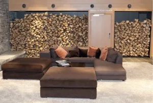
White has never gone out of fashion, although, there were indeed,
full seasons when the courage of using strong colors in elements of interior
design has turned into quite a persistent trend. Now, more than ever, perhaps
because of the avalanche of visual information that we load on computer screens,
the “all white” trend in interior design has returned stronger then ever.
Moreover, new technology constantly creates new materials – meaning “textures”,
and textures are one of the strongest arguments for choosing a white interior
of various shades.
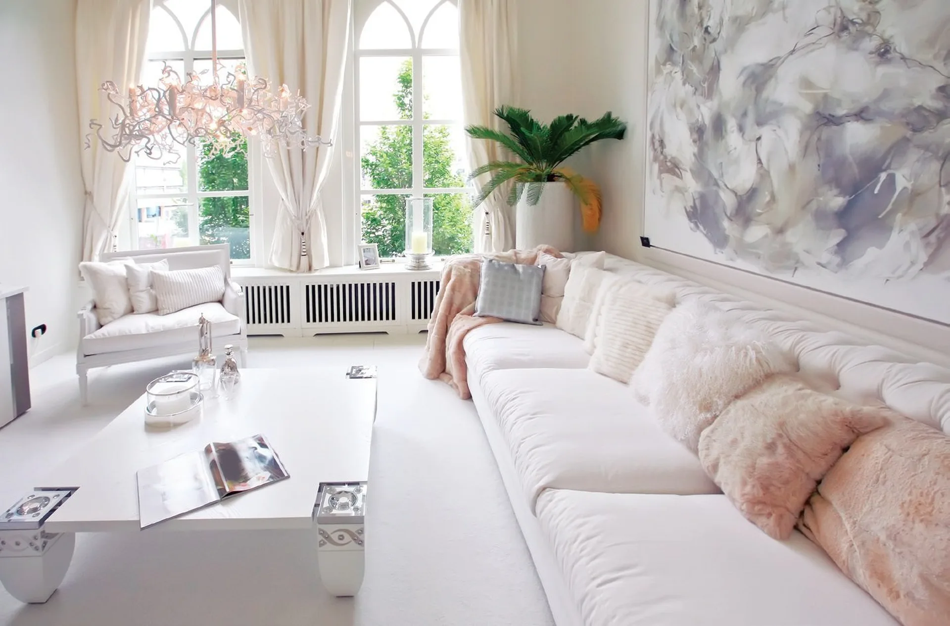
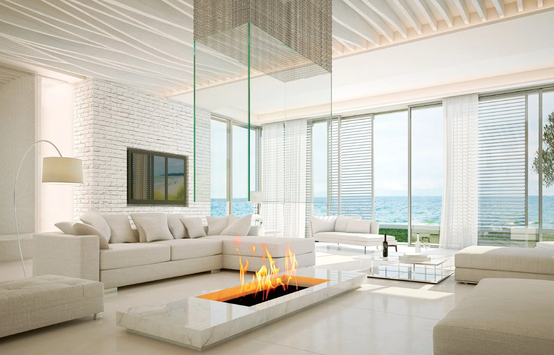
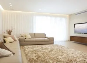
Choosing white as the main color creates a subtle atmosphere defined by purity, simplicity and elegance. Moreover, with the risk of appearing to have suddenly fallen into mystics, I will emphasize the power this color has, to constantly transmit freshness, softness, balance and harmony. Returning to practical issues, white = light , which means that natural light is improved, the artificial light is enhanced and white in small or dark spaces becomes a real tool which extends the space to desired dimensions - length, width and height.

10 Reasons to choose „all white“
1. It’s the most „tolerating“ first step in setting up an interior
It’s like a blank canvas on which you can paint whatever you want. If
you start with purple wallpaper with golden flowers, your decorating options
are dramatically reduced.
2. White is warm and comfortable
People inaccurately perceive white as cold and distant because they
think that the minimalism of the color transfers into the room. Wrong. An
indoor “all white” should avoid heavy pieces with sharp lines and chairs lined
up like soldiers. On the contrary, fluffy pillows and a relaxed somewhat
“unfinished “ design would fit perfectly with white. Vintage and hand-made
finds are the most elegant expressions in a “white on white “ color scheme.
3. White never gets boring
Beige can be boring but too much white - never! It’s just too
dramatic. Think about wedding dresses: for hundreds of years no one decided
that wedding dresses should not be white because we are bored of them.
Because, you cannot be bored with white.
4. Choose white vintage objects
This means giving up small decorations in all colors of the universe
and focusing ones attention on some sophisticated pieces chosen for their
antique authenticity or for their lively organic forms.
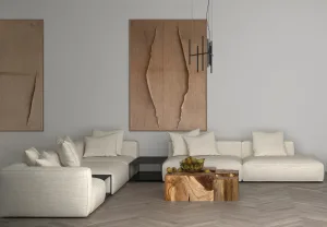
5. A white interior is more complex
A white interior will force you to pay attention to details, because
you don’t have strong colors to distract your attention. It helps you to choose
carefully, even the most insignificant things, like switch or knob. Such an
interior becomes complex because of the details you have carefully chosen.
6. Wood and marble achieve their best aesthetics in an „all white“
interior
Simple. There is no other combination of materials and colors which
bring out the texture and shades of wood and marble more clearly – we are
obviously talking about the white tones of these materials, not their colored
options.
7. White has the power to bring together disparate or outdated spaces
There are buildings to which new rooms, floor and walls have been
gradually added. There are houses which might have gorgeous pieces of
furniture which do not fit together. Well, white floors, white walls and, for
the bold, even a coat of white paint on some of the pieces of furniture will
streamline, unify, give coherence and charm to the space.
8. A white interior lets you approach it in a fashionable style
You can freshen up a room with some turquoise or lime pillows in the
summer or with an orange blanket or curtains in winter. Each season, or every
important moment of your life has a kind of blank canvas which you can
transpose in the setting, with minimal effort, just as you accessorize a simple
black dress differently so that it is suitable for the theater but also for a
reception. Versatile accessories include all textiles: curtains, bedding,
quilts, tablecloths etc.
9. White „fix“ mistakes
Seriously, if there are small aesthetic mistakes, a white on white
color scheme makes them much less visible. I am talking about sockets in
unusual places, about visible pipes etc. Moreover, if there are any plaster
cornices and ceiling details in old houses, they will be even more beautiful
and better highlighted and if they are not “crushed” with strong colors.
10. White does not have scratches
Yes, it has, but the scratches are less visible and they are fixed
much easier. I am speaking about the floors, furniture, doors etc. as opposed
to dark colored ones where everything is visible: from a finger mark to a speck
of dust.

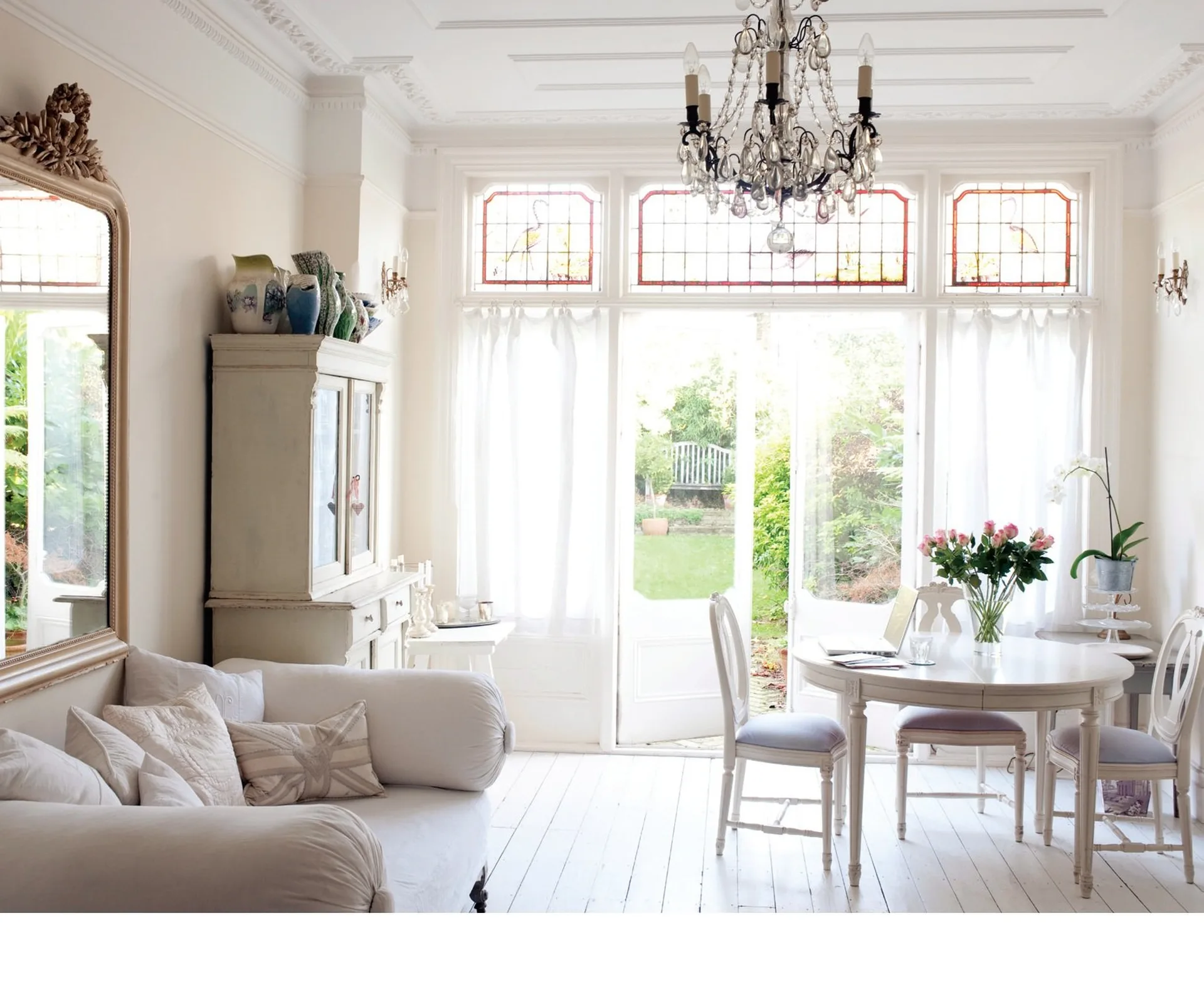
Small tips for great effects
antiques + White = Love
An “all white” interior is instantly teleported to the opposite of
minimalism if augmented with authentic antiques.
Pattern kitchen
We are talking about the patterns like drawing printed or embossed surfaces. Patterns really look sensational in an all white kitchen. Here and only here are these drawings emphasized, because of the lack of strong colors. A white kitchen is extremely sophisticated when tiles and cupboard fronts are not smooth, but have a complicated relief.
Heirloom
Never mind that the old pieces of furniture came from different stories - on the contrary, a Victorian mirror, a coffee table and a crib from the beginning of the century are linked by overlapping almost identical shades of white.
Texture Overlay
It’s the only time when wool, fur, sequins, veil, silk, linen and any other material you can think of, looks elegant and spectacular: when dealing with shades of white: from snow to cream, from butter to meringue .
The
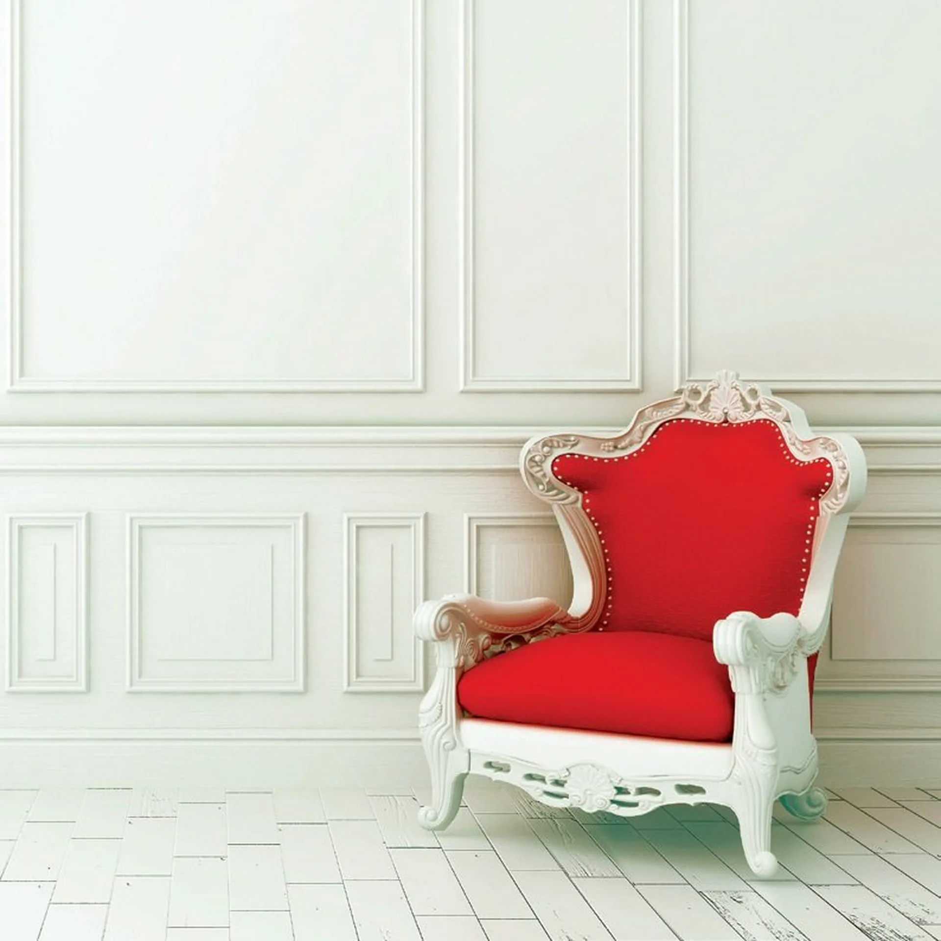
star color
This can be a statement of style: a home designed and decorated white
on white, which has a purple pole. Or a red wall. Or a fuchsia ceiling. It is a
powerful and bold statement.